BMI 525 – Graph Exploration and Brief
Christine Doyle
May 5, 2025
TYPE OF GRAPH:
Bar Chart – aka Column Chart
DATA:
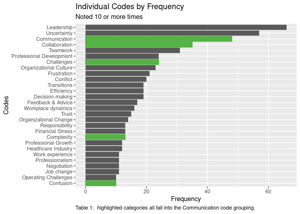
This data set was gathered as a part of a qualitative project involving interviews about organizational behavior. The individual concepts have been grouped into larger code groups. This table shows the most frequently identified concepts, and then specifically highlights the multiple concepts that are grouped into “Communication.”
Representation Description:
Bar charts display categorical information on one axis with continuous information on the other axis. The categorical variable may be random or ordered. The ordered variable may be sorted alphabetically or by number or by ascending or descending order based on the other variable. Typical categories might include a graph that has days of the week or locations on one axis (most often the x-axis) against the number of times something falls into that category on the second axis (most often the y-axis). The x-axis and y-axis typically will intersect at the bottom left corner of the chart. If the values are both positive and negative, the axis will be in the center. If the values are all negative, the axis will be at the top.
Bar charts may be oriented with the categorical variable either across the x-axis or y-axis. The orientation of the bar determines if it’s called horizontal or vertical. Horizontal charts have the categorical variable down the y-axis, and are often selected when there are long category labels or a large number of categories.
Bar charts may be grouped or stacked to provide information about two or more categorical variables. Grouped bars may be seen when comparing variable changes between two groups, for example, sales over time. Grouped bars can be easy to use with both positive and negative values. Stacked bars are more often seen when comparing both totals and proportions, particularly looking at change over time or comparison between the different primary categories. Stacked bars are more difficult to use if values are both positive and negative. Stacked bars may also be normalized to the same total height so that the sub-bars become the proportion of that secondary variable.
The bar chart is the most frequently used visualization for non-scientific audiences (i.e., newspaper/press, financial, and government/organizational).
A histogram is not the same as a bar chart, as it is two continuous variables, with one of them divided into groups, although it does look somewhat similar. A line chart is closely related to a bar chart, but implies a continuous progression.
How to Read a Bar Chart:
Simple bar charts should be examined for the order of the categorical variable — is it based on time, based on frequency, or based on something else. This will facilitate understanding of the overall data. Grouped or stacked bar charts should also be examined for the order of the first categorical variable, again looking at time or frequency or something else. If the data is not ordered by time, generally the first categorical variable will be presented in ascending or descending order, and the other variables will remain paired to the first.
Presentation Tips:
Interactivity: Bar charts are not often seen in an interactive presentation. When they are, the goal is to provide additional information about a given category when you select or hover over a particular selection.
Annotation: Annotation showing the exact value of a given variable may be presented overlaying or adjacent the bar. This can facilitate distinguishing between variables with similar amounts, particularly if the scale is condensed and if you are showing stacked bar charts where it is harder to appreciate changes in size of the bar.
Color: Color is often used to distinguish between the different categorical variables. It is most helpful for grouped or stacked bar charts, but can also be helpful in highlighting a specific category or category group.
Composition: The main arrangement decision is how the primary categorical variable is sorted. Dates and times are frequent choices, and may include years, months, days of the week, quarters of the year, etc. Ordering by frequency (either ascending or descending) is also a common arrangement.
Variations and Alternatives
As mentioned above, both grouped and stacked bar charts are variations of the simple bar chart. Depending on the data and time definitions, one might also consider a Sankey diagram.
How to Create it
code_freq <- read_csv(“data/CodeFrequency4Ranalysis1.csv”, col_types = cols()) code_freq <- code_freq %>% janitor::clean_names()
basic_plot = ggplot(code_freq, aes(x=frequency, y=reorder(code, +frequency))) + geom_col() + labs(x = “Frequency”, y = “Codes”) + ggtitle(“Individual Codes by Frequency”, subtitle = “Noted 10 or more times”) + scale_color_hue(c=20) + geom_col(data = subset(code_freq, code_group == “Communication”), color = “#55b244”, fill = “#55b244”) + theme(plot.caption = element_text(hjust = 0)) + # set the left align here labs(caption = “Table 1: highlighted categories all fall into the Communication code grouping.”)
###